File talk:European Union map.png
Appearance
- See also: Image talk:EU map names isles.png for earlier discussion on issues leading to this map.
This new version
[edit]
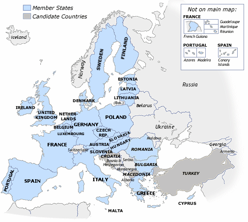
Personally, I consider this version with all-horizontal text inferior to my own version (despite the latter's faults), see right. I also object to the author of this new version not having provided a link to that earlier version (and thus its earlier revisions). zoney ♣ talk 11:05, 2 Nov 2004(UTC)
- I must say I much prefer the previous version; its fonts are more nicely anti-aliased and I find it far more aesthetic with differing font sizes and orientations. Perhaps it would be even better if it was larger (we can always keep it smaller in the text); that way, anyone who clicked on it in the article would get a higher-quality, larger map. (On a side note, the colours of candidates and 2007 admission in both versions seem rather out-of-style and stand out far too much, don't they? I myself prefer the previous style (the initial version).) —Sinuhe 12:32, 2 Nov 2004
- I also like the old version better, the new one looks too uniform, yet has colors that are too bright. --Joy [shallot] 10:58, 6 Nov 2004 (UTC)
- Likewise preferring the old version. Aris Katsaris 13:18, 6 Nov 2004 (UTC)
- I have trouble distinguishing the "Member States" and "2007 Admission" color difference.--68.22.251.127 21:08, 10 Dec 2004 (UTC)
An archive of discussion of these two maps is at Wikipedia:Featured pictures candidates/November-2004. - [[User:Bevo|Bevo]] 17:37, 3 Nov 2004 (UTC)
